
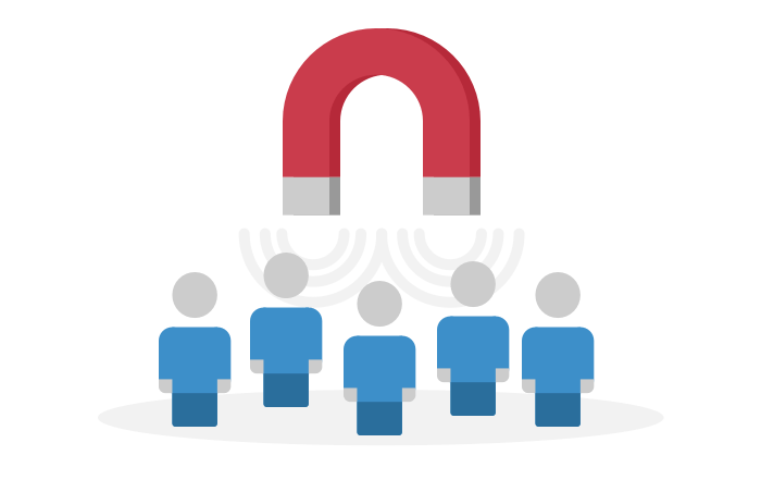
Your website is your business's own digital property that informs and converts browsing visitors into paying customers
Why does investing in a new website or updating my old site matter?
A well-designed site can inform and hold attention. It can make you stand out among your competition. It communicates your brand, and your offerings and services. Visitors don't have to just take your word, either - you can display testimonials, credentials, and photos of past projects. Eyes don't linger long, so it's important to design a site that has appeal and is easy to navigate so people can find what it is they are searching for. Here are some eye-opening stats on the importance of not only having an informative site for your business, but ensuring it's designed for a better user experience, no matter how they are interacting with your website.
Almost half of all Google searches are looking for local information.
3 in 5 people using their smartphone to search say they are more likely to contact a business IF the website is mobile-friendly (Source: Hubspot).
Your website should make it easy to connect with you and drive sales - whether products can be purchased directly on the site, or whether it funnels leads for services, such as offering a calendar for booking an appointment, or a form for requesting a quote that will result in a quick call back from the sales team.
Your business website should also be designed for the different types of devices visitors use - whether they are browsing from a computer, tablet, or mobile smartphone.

Try looking at this site on another type of device - it will adjust and load for that particular screen size, and elements like the phone number will change to a "click to call" feature on the smartphone version of this site. This is because at Excelsior Digital Solutions, we design adaptive and responsive websites for a better experience for your visitors.
When we build you an adaptive website, it will change its layout automatically to fit all the different screen sizes out there.
The content layout will adjust as well, so that mobile browsers can better interact with the site, such as through click-to-call buttons. Google search and Amazon also use adaptive website design for the mobile experience.
This is in contrast to a responsive website - which automatically adjusts the size of content on the page, but does not change the layout.
The site elements "slide" down based on the screen resolution. Our sites have responsive elements, but are adaptive for a better, faster viewing on mobile.

As more people than ever are browsing from their phones to find local services, and as Google prioritizes the quality of a site's mobile experience in how it decides to RANK the site, it's clear that having an adaptive and responsive website design is key to future-proofing your site, and driving revenue. You may believe your years-old site is good enough and don't want to go to the expense of updating. But while you may save the expense in the short term, if your website is out of date and not optimized for smartphones, it's a massive opportunity cost in the long run. You're leaving money on the table that your competitors will scoop up - when potential customers find their site in search instead of yours.
Even if you already have a website made a few years ago, so much has changed. And not just the technology, but how people use it. They are now online more than ever before outside the home, as smartphones with data proliferate. Consumers using their smartphones search differently - they tend to type in fewer words but have higher buying intent than those browsing at home from their laptop or desktop. Smartphone users are searching for more immediate solutions while on the go. They also rely on data connections with slower load times and have smaller screens that of course respond to touch. So, a mobile version of your site should be optimized for their experience, and not just be a stripped down version of the full site - how websites used to be made.
The website build process isn't finished when the "publish" button is clicked either. We continue doing work behind the scenes to rank the site on search engines, building its presence and trust factor so it will rank higher. Most people searching for a service using key words only check the top results and don't go past the first page. So, improving ranking is imperative.
We can also manage the site on an ongoing basis, updating with new authoritative content, adding new features, and monitoring engagement. These steps will continue to improve search engine visibility, too.
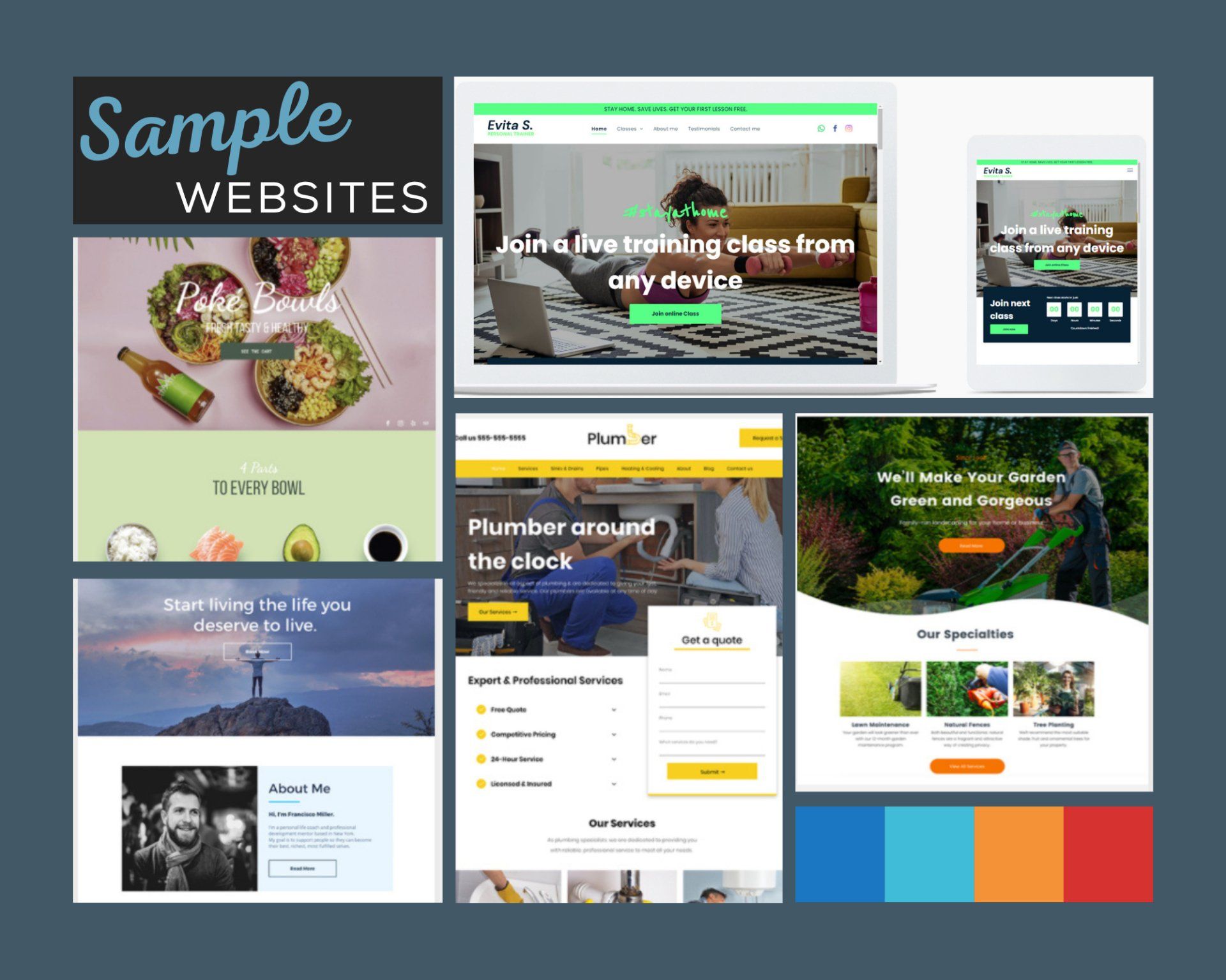
NEW! See our sample website templates, and even order a FREE mockup of the 2021 version of your site!
More Services:
